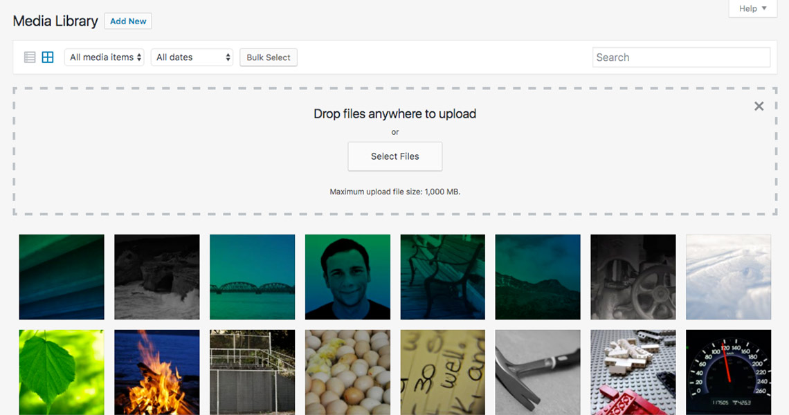
Images are great; they can help sell your products, reinforce your content message, and provide visuals that improve the experience visitors have on your website. The world is taking more photographs than ever before and users are more likely to engage with content enhanced by visuals. But we need to remember that huge images, too many images, and unoptimized images are also some of the biggest detractors to site performance.
Balancing image quality versus image size
Many website owners or web developers do not take the time to consider how images can affect their site’s performance and their visitors’ experience.
A photography site with small or pixelated images is doing a disservice to themselves and their potential customers; likewise, an online store with hundreds of product thumbnails is hurting their performance all the same.
Below you will see the same photo at full quality, and highly compressed. Most sites are going to want to use images that find a balance in middle of these two extremes.
 A high-quality jpg photo(329kb)
 A low-quality jpg photo(31kb)
Image formats
Two image formats really dominate most web today: png and jpg. The lossless compression based png format is great for vector based images that don’t need too many colours or that require transparency. Jpg images, on the other hand, work great for photographs and images with a large number of colours, and they can be lossly compressed to find the right balance between image clarity and file size.
Number of http requests
It is important to remember that every image loaded on the site is another HTTP request and adds more work for your browser to do, impacting the performance of your web site. We covered HTTP requests in detail a few weeks ago on our blog. You have to decide if it’s worth it for your business to have more images when this will likely slow down your website. Take time to consider the content of each image and if that image will enhance your site or detract from it.
Responsive images
Since WordPress 4.4 there has been support for srcset and sizes attributes on images built into the CMS. Way before those were introduced WordPress had the foresight to store the original image uploaded to the Media Library and generate the different images that the theme and plugins need.
Now, with srcset, and sizes attributes, WordPress is automatically adding the proper markup for browsers to load the image size that best fits the size of the device. On desktop devices the browser can load an image with larger dimensions and on mobile devices the browser can load up an image with smaller dimensions and filesize. This functionality is part of the output of your main content (from the WYSIWYG editor) of the page but will not be applied to your other images unless the theme or plugin developer specifically added the functionality. Check out this post on using the responsive image functionality of WordPress at Smashing Mag.
Useful Plugins and resources
Here are a few plugins we recommend checking out for automatic optimization of your images as they are uploaded to WordPress:
- EWWW Image Optimizer
- WP Smush
- A recent list of image optimization plugins and their capabilities.
- A comparison of how the image optimizers do, numerically.

